The system
The pages and figures are built from a small set of tokens and six decisions. They are listed here so the design can be rebuilt or adapted, with a model that moves three of them, every source the guide relies on, and a credit for every photograph.
Ground, sheet, field and well; slate for data and ink for what matters most. Cobalt stays outside the figures, for links and focus.
Six decisions
Each one is a rule from chapters 2 to 5, set as a valueThe page: twelve columns of 64 px with 32 px gutters. The figures: all twelve columns, split into regions of whole columns, four and eight or six and six, inside sheets with an 8 px inset.
Ground, sheet, field and well. Higher is lighter. An inner radius is the outer radius minus the inset: 20 for a sheet, 12 for a field.
One family. Values 48 px at weight 600, text and figures 15 px, labels 14 px, ticks 12 px. Tabular, duplexed figures.
A bold value over a grey label at each mark. One decimal for money in thousands. A real minus sign. Plain words, such as budget left, with every term defined where it appears.
Greys only in the figures: slate for the main data, paler slate for secondary data, hatching for forecasts, a dashed outline for plans. Ink for what matters most and for selection. No red.
Controls sit on the chart they change. Pointing highlights and never filters. Every value is printed, so nothing depends on hover.
Tokens you can move
The cover’s dashboard, restyled liveSources
103 works behind the twelve rules, in 14 groups1 · A grid that divides
- Gerstner, Designing Programmes, 1964The Capital grid of 1962: a page 58 units wide with 2-unit gutters, which carries one to six columns of whole units.
- Few, With Dashboards, Formatting and Layout Definitely Matter, 2008Counts the rigid symmetrical grid among the layout mistakes of dashboard design.
- Müller-Brockmann, Grid Systems in Graphic Design, 1981The standard manual of grid construction. It calls the grid an aid, not a guarantee.
- Bosshard, The Typographic Grid, 2000About two dozen of the author’s own works with the grids behind them, and no single recipe.
- Vignelli, National Park Service, Unigrid, 1977One sheet system for the brochures of more than 400 parks. The first brochure to use it appeared in 1978.

2 · Instruments
- Tufte, Sparkline theory and practice, from Beautiful Evidence, 2006Word-sized graphics that set a value beside its history, with a grey band for the normal range in the medical examples.
- Few, Bullet Graph Design Specification, 2006, revised 2013The formal definition: a featured measure, a comparator and optional qualitative ranges.
- Brinton, Graphic Methods for Presenting Facts, 1914An early American manual of charts for business, free on the Internet Archive and still a good source of component-bar forms.
- Spear, Charting Statistics, 1952Her range bar, with an interquartile box, predates the box plot. A compact way to show spread within a row.
- Hollifield, Oliver, Nimmo, Habibi, The High Performance HMI Handbook, 2008Grey screens, analog indicators with a normal range, and colour only for abnormal states.
- ISA, ANSI/ISA-101.01-2015, human-machine interfaces for process automation systemsSets out a life cycle for process displays around each site’s written HMI philosophy and style guide. It does not itself prescribe grey screens; that comes from high-performance HMI practice.
- Braseth and colleagues, Information Rich Design, HaldenLarge-screen process overviews built from aligned mini-trends and Gestalt grouping.
- Desbarats, Why I stopped using bullet graphs, Nightingale, 2022Eleven objections. Problems do not stand out, and lower-is-better and ideal-range measures need variants. His alternative marks only what crosses an action threshold.
- Chin, with Bryar, The Amazon Weekly Business Review, Commoncog, 2024Amazon’s weekly review of 400 to 500 metrics, most drawn as one chart: the trailing six weeks beside the trailing twelve months.
- Powsner, Tufte, Graphical summary of patient status, The Lancet, 1994Small aligned histories with normal ranges on one page. A clinical ancestor of the sparkline.
3 · Routine variation
- Wheeler, Understanding Variation, 1993Process behaviour charts separate routine weekly variation from a real change. A stronger comparator than last period once history exists.
4 · Drawn identities
- Playfair, The Commercial and Political Atlas, 1786Import and export lines with the area between them tinted as the balance. An early case of an accounting identity drawn as a shape.
- Vicente, Rasmussen, Ecological interface design: theoretical foundations, IEEE SMC 1992Make the constraints of the work domain directly visible. The theory behind drawing an identity as geometry.
- Bennett, Flach, Display and Interface Design: Subtle Science, Exact Art, 2011Configural displays and emergent features. When variables are drawn so their relationship forms a shape, a fault changes the shape.
5 · Surfaces and shading
- Imhof, through Tufte, Cartographic Relief Presentation, 1965; Envisioning Information, chapter 5Strong colour in small areas on a muted ground, and large areas kept quiet. The rule behind one accent on tonal surfaces.
- Robinson, The Look of Maps, 1952Visual hierarchy and figure and ground in cartography. Maps solved layered surfaces long before interfaces did.
- Patterson; Jenny, Shaded relief practice and researchHow Swiss-style relief generalises terrain and adjusts light locally. Shading as a selective, designed act.
- Palmer, Common region: a new principle of perceptual grouping, Cognitive Psychology, 1992Elements inside a shared boundary group strongly and hierarchically. The basis for nested surfaces, and the reason every panel boundary is a claim.
- Albers, Interaction of Color, 1963A colour is read relative to its surround.
- Cleveland, McGill; Heer, Bostock, Graphical perception, JASA 1984; crowdsourced replication, CHI 2010Position on a common scale is read most accurately; shade and area least.
- Szafir; Stone, Modeling color difference for visualization design, 2018; In color perception, size matters, 2012Small marks need larger colour differences to be told apart. Thin lines and 3 px bars cannot rely on subtle tints.
- Harrison, Ishii, Vicente, Buxton, Transparent layered user interfaces, CHI 1995Measured how translucency trades focus against awareness. The evidence for and against see-through panels.
- Colby, Scholl; Cooper, Transparency and blur as selective cues, 1991; Information Landscapes, 1994The MIT Visible Language Workshop treated translucency, blur and depth as information design. An origin of the soft layered look.
- Google; Radix, Material 3 colour roles; Radix 12-step scalesTwo working role systems. Material names five container tones by emphasis. Radix gives each of twelve steps a job.
- IBM, Carbon Design System, colour and layeringSurface roles as named tokens. In the light themes, layers alternate between white and a pale grey.
- W3C, WCAG 2.2, non-text contrastThe parts of a control or a graphic that a reader must see need a contrast of at least three to one against what is next to them.
6 · Notation
- Hichert, Faisst, Solid, Outlined, Hatched, 2019, and the IBCS standardA notation for reports: solid for actual, outlined for plan, hatched for forecast, grey for the prior period.
- Bertin, Semiology of Graphics, 1967Names the visual variables a mark can vary by, texture among them. The link is a summary.
7 · Shared axes
- Marey, after Ibry, Train graph, La Méthode graphique, 1878Distance against time, with speed as slope. A whole timetable on one pair of axes.
- Bertin; Perin, Dragicevic, Fekete, The reorderable matrix; Bertifier, IEEE VIS 2014Encode each cell, then reorder rows and columns until structure appears.
- Becker, Cleveland, Shyu, The visual design and control of Trellis display, JCGS 1996Panels conditioned on a variable, laid out in rows and columns with shared scales.
- Javed, McDonnel, Elmqvist, Graphical perception of multiple time series, IEEE TVCG 2010Separate small charts were generally more efficient for comparisons across many series, and one shared chart for comparisons close together.
- Stolte, Tang, Hanrahan, Polaris, IEEE TVCG 2002A table algebra that nests small charts by dimension. The research behind Tableau.
- ECMWF, Ensemble meteograms, Forecast User Guide 8.1.4Several weather parameters stacked on one time axis, each drawn as box-and-whisker steps.
- Merchandise planning, WSSI: weekly sales, stock and intakeThe planner’s native grid. Weeks across; sales, stock and intake down; open-to-buy as its result.
- Woods, Visual momentum, International Journal of Man-Machine Studies, 1984How to keep a reader oriented across many displays: an overview, landmarks, overlap and fixed positions.
- Wang Baldonado, Woodruff, Kuchinsky, Guidelines for using multiple views in information visualization, AVI 2000Eight rules, including parsimony: add a view only when it earns its cost.
- Gleicher and colleagues, Visual comparison for information visualization, 2011Every comparison is built from juxtaposition, superposition or an explicit encoding of the difference.
- Burke, in Aicher’s department, Schedule for all sports disciplines, Munich 1972Dates, events and pictograms cross-indexed on one sheet, printed on both sides in seven colours.
- Munzner, Visualization Analysis and Design, 2014A framework of what, why and how, with rules of thumb. Eyes beat memory: compare side by side, not from recollection.
- Becker, Cleveland, Brushing scatterplots, Technometrics, 1987Named brushing: a selection made in one view marks the same items in every other view. The link is a summary.
- Ware, Cross-view brushingA design pattern for highlighting selected items across several representations.
8 · Tables
- Bartram, Correll, Tory, Untidy data: the unreasonable effectiveness of tables, IEEE TVCG 2022Data workers want to see and touch the table throughout analysis. Tables are a visualization idiom in their own right.
- Ehrenberg, Rudiments of numeracy, Journal of the Royal Statistical Society A, 1977The classic paper on numeric tables: round hard, order rows by size, and put figures to be compared in columns.
- Schwabish, Ten guidelines for better tables, Journal of Benefit-Cost Analysis, 2020A modern checklist: right-align numbers, show units sparingly, lighten the rules.
- Tschichold; Rutter, Tschichold’s table rules, quoted by Rutter, 2017Set tables as text to be read, keep furniture to a minimum, avoid vertical rules.
- Rao, Card, The Table Lens, CHI 1994A table whose cells become small bars, with rows that open to text on focus. Bertin’s in-cell bars, brought to the screen.
- Gratzl, Lex, Gehlenborg, Pfister, Streit, LineUp, IEEE InfoVis 2013Ranks items on several weighted attributes with stacked bars inside a table.
- Sutnar, Lönberg-Holm, Catalog Design Progress, 1950Product information designed as function, flow and form. The classic on structuring commercial data for fast lookup.
- Crouwel, van de Wouw, Dutch telephone directory, 1977Condensed Univers, lower case only, numbers placed before names so no leader dots were needed.
- Twyman, A schema for the study of graphic language, 1979Classifies graphic language by configuration, including list, matrix and branching. Useful vocabulary for deciding what a view is.
9 · Type for figures
- Carter, Bell Centennial, 1975–78Drawn for telephone directories printed fast on poor paper.
- Frere-Jones, Retina, 1999Drawn for Wall Street Journal stock listings at very small sizes, now in the MoMA collection. Type as an instrument for dense figures.
- Frutiger, Univers, 1957Twenty-one variants named by a two-digit code for weight and width, planned as one family from the start.
- Type Network, Google, Roboto Flex and the grade axisGrade changes apparent weight without changing width. Useful in dark mode, where light text looks heavier.
- Instrument, Instrument SansAn open variable family with a 75 to 100 width axis and tabular figures. The sans used on this page.
- Ruder, Typographie, 1967A manual on rhythm, proportion and the space inside and around letters, from the Basel school.
- Hochuli, Detail in Typography, 1987Letters, letterspacing, words, wordspacing, lines and linespacing in sixty-four pages.
10 · Uncertainty
- Britton, Fisher, Whitley, The Inflation Report projections: understanding the fan chart, Bank of England, 1998The fan chart, first published in February 1996, shows a forecast as nested probability bands in place of a line with bounds.
- Kay, Kola, Hullman, Munson, When (ish) is My Bus?, CHI 2016Introduced quantile dotplots: a distribution as about twenty countable dots. Readers estimated probabilities more consistently than from density curves.
- Fernandes, Walls, Munson, Hullman, Kay, Uncertainty displays using quantile dotplots or CDFs improve transit decision-making, CHI 2018Decision quality, measured. Dotplots and cumulative curves beat intervals and point estimates.
- Hullman, Resnick, Adar, Hypothetical outcome plots, PLOS ONE 2015Animated draws from a distribution outperformed error bars and violins for judging which of two quantities is larger.
- Correll, Gleicher, Error bars considered harmful, IEEE TVCG 2014Bars with whiskers make values inside the bar look likelier than values outside it.
- Joslyn, LeClerc, Uncertainty forecasts improve weather-related decisions, Journal of Experimental Psychology: Applied, 2012Showing uncertainty improved decisions and softened the effect of a forecast that missed.
- Padilla, Kay, Hullman, Uncertainty visualization, Wiley StatsRef, 2021The best single review: the techniques, the psychology behind each, and frequency framing.
- Savage, The Flaw of Averages, 2009Plans built on average demand are wrong on average. An argument for planning against a distribution once one exists.
11 · Controls
- Shneiderman, Dynamic queries for visual information seeking, IEEE Software, 1994Results update within a tenth of a second as sliders move, so a query becomes something to steer.
- Heer, Shneiderman, Interactive dynamics for visual analysis, Communications of the ACM, 2012Twelve tasks in three groups: specifying data and views, manipulating views, and recording and sharing the analysis.
- Victor, Up and Down the Ladder of Abstraction, 2011An interactive essay that moves between one concrete case and the whole range of a parameter.
- Victor, Explorable Explanations, 2011Reactive documents: a number in a sentence can be dragged, and the text recomputes.
- Bostock, Carter, Tse, Is It Better to Rent or Buy?, The New York Times, 2014Each slider sits on a small chart of the outcome across the whole range of that input.
- Sedlmair, Heinzl, Bruckner, Piringer, Möller, Visual parameter space analysis, IEEE TVCG 2014A framework for exploring model inputs and outputs: a data flow, four navigation strategies and six tasks.
- Howard, Decision analysis: practice and promise, Management Science, 1988Usually cited for the tornado diagram: one-way sensitivities sorted by swing, each input moved between assessed low and high values. A form for ranking assumptions by their effect on a result.
- Fildes, Goodwin, Lawrence, Nikolopoulos, Effective forecasting and judgmental adjustments, International Journal of Forecasting, 2009Small overrides tended to hurt accuracy, large reasoned ones helped, and adjustments leaned optimistic.
- Gilliland, Forecast value added: a reality check, Foresight, 2013Compare each step of the process with a naive forecast. The stairstep report shows where review adds or removes value.
12 · Plain words
- Gowers, Plain Words, 1948Written at the request of the British Treasury to help officials replace jargon with a short, clear style. The link describes its editions.
- Kinross, The rhetoric of neutrality, Design Issues, 1985Even a railway timetable persuades. A calm analytical style is a rhetorical choice and should be owned as one.
Further reading · forecasting and retail practice
- Fildes, Ma, Kolassa, Retail forecasting: research and practice, International Journal of Forecasting, 2022The standard review of retail forecasting, from strategic decisions down to store and item.
- Fisher, Hammond, Obermeyer, Raman, Making supply meet demand in an uncertain world, Harvard Business Review, 1994Sport Obermeyer, a skiwear maker, planned its buying around how uncertain each style’s demand was.
- Kolassa, Rostami-Tabar, Siemsen, Demand Forecasting for Executives and Professionals, 2023A current, readable text with an online edition.
- Vandeput, Demand Forecasting Best Practices, 2023Practical guidance on metrics: track bias and absolute error together and avoid MAPE.
- Syntetos, Boylan, Croston, On the categorization of demand patterns, Journal of the Operational Research Society, 2005Classes items as smooth, erratic, intermittent or lumpy from two statistics, with cut-offs at 1.32 and 0.49.
- Wickramasuriya, Athanasopoulos, Hyndman, Optimal forecast reconciliation through trace minimization, JASA, 2019Forecasts at item, category and total level can be made to add up.
- Makridakis, Spiliotis, Assimakopoulos, The M5 accuracy competition, International Journal of Forecasting, 202242,840 hierarchical Walmart series with many zeros. Evidence on what works for intermittent retail demand.
- Ferreira, Lee, Simchi-Levi, Analytics for an online retailer, Manufacturing and Service Operations Management, 2016Demand forecasting and price optimisation at Rue La La, an online fashion retailer, with a measured revenue effect.
- Caro, Gallien, Clearance pricing optimization for a fast-fashion retailer, Operations Research, 2012Zara’s markdown process, tested in a field experiment.
- Operations research, The newsvendor critical ratioFor a single buy before a season, the best service level is the underage cost over the sum of underage and overage cost. A principled source for a stock target.
- Vermorel, Lokad, Prioritized orderingRank every possible purchase unit by expected economic return and buy down the list until the budget is spent. An alternative to item-by-item alerts.
- Forrester; Sterman, Industrial Dynamics, 1961; Business Dynamics, 2000Stock-and-flow notation. Inventory is a stock; sales and receipts are flows.
Further reading · dashboards and evidence
- Sarikaya, Correll, Bartram, Tory, Fisher, What do we talk about when we talk about dashboards?, IEEE TVCG 2019A design space and typology of dashboards, built from a survey of the kinds in use.
- Bach, Freeman, Abdul-Rahman, Turkay, Khan, Fan, Chen, Dashboard design patterns, IEEE TVCG 2023Forty-one patterns for content and composition, with the trade-offs between screen space, paging and abstraction.
- Franconeri, Padilla, Shah, Zacks, Hullman, The science of visual data communication: what works, PSPI 2021The most complete review of what is known to work, written for practitioners.
- Kong, Agrawala, Graphical overlays, IEEE TVCG 2012Five kinds of layered aid: reference structures, highlights, redundant encodings, summary statistics and annotations.
- Stokes, Setlur, Cogley, Satyanarayan, Hearst, Striking a balance, IEEE TVCG 2023Readers preferred charts with text over charts alone. Put words at the mark.
- Heer, Kong, Agrawala, Sizing the horizon, CHI 2009Horizon graphs keep a time series readable at small heights, with measured limits on how small.
- Ström-Awn, UI Density, 2024Density is the value delivered per unit of space and time, with visual, information and temporal components.
- Bateman and colleagues; Inbar, Tractinsky, Meyer, Useful junk?, CHI 2010; Minimalism in information visualization, 2007Counter-evidence to strict minimalism. Embellished charts were recalled better, and people did not prefer the most reduced bar chart.
- Setlur, Cogley, Functional Aesthetics for Data Visualization, 2022Perception, semantics and intent treated together.
Editions
- 1 Oct 2026First edition. Design literature gathered for one retail planning case.
- 1 Oct 2026Second edition. Claims re-checked, eight neighbouring fields added, one system proposed.
- 2 Oct 2026Learn dashboard design with me. The people, twelve rules and a model for each, on one page.
- 3 Oct 2026This edition. Nine chapters, the faces behind the rules, the wider research rewritten with charts from published data, the dashboards we made, the figures redrawn in grey on general examples, and a French translation.
Photographs
Portraits are freely licensed photographs, shown in greyscale and cropped square, each credited here with its author and licence. No free photograph was found for 28 people, who are shown by their initials: William Playfair, Willard Brinton, Donald Wheeler, Marie Reidemeister, Mary Eleanor Spear, Karl Gerstner, Emil Ruder, David Woods, William Cleveland, Robin Kinross, Jost Hochuli, Jens Rasmussen, Kim Vicente, Stephen Palmer, Marshall Fisher, Colin Ware, Bill Hollifield, Robert Fildes, Michael Gleicher, Maureen Stone, Mike Bostock, Shan Carter, Archie Tse, Rolf Hichert, Matthew Kay, Jessica Hullman, Nick Desbarats, Melanie Tory.
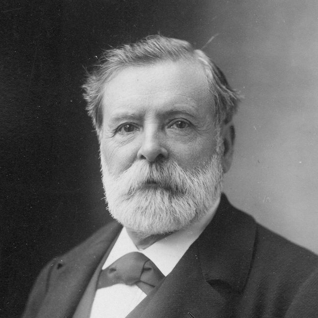 Étienne-Jules MareyPhoto: Atelier Nadar, Bibliothèque nationale de France, public domain · source
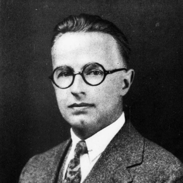 Walter ShewhartPhoto: Bell Laboratories Record, August 1926, public domain · source
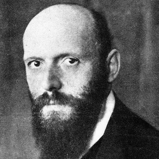 Otto NeurathPhoto: Heinrich Hoffmann, 1919, National Library of Israel (Schwadron collection), public domain · source
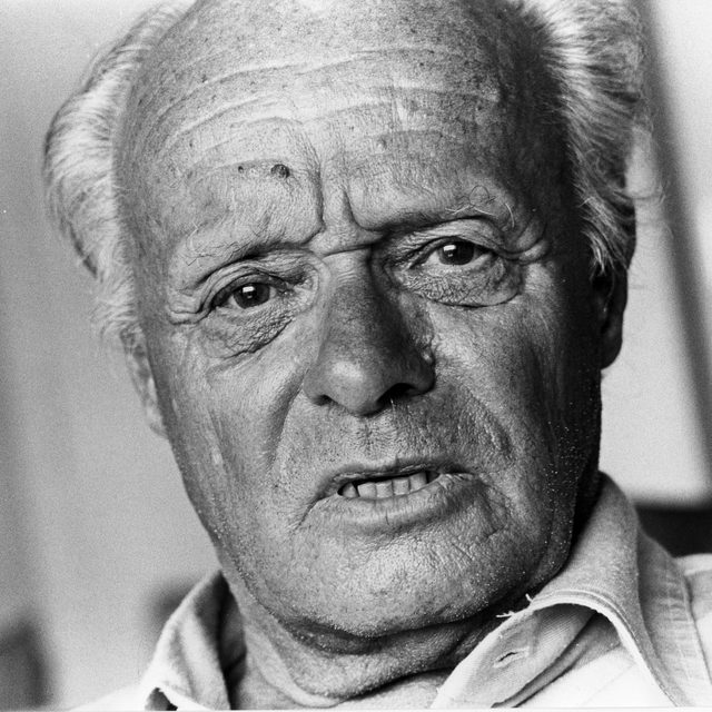 Gerd ArntzPhoto: Robert Scheers, collectie Haags Gemeentearchief · source
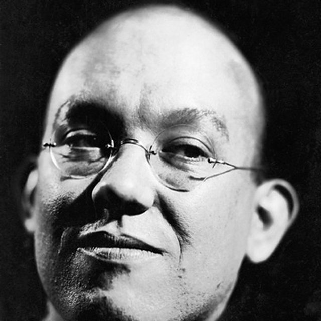 Jan TschicholdPhoto: Eduard Wasow, c. 1930, public domain · source
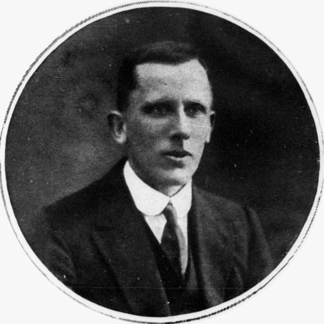 Ernest GowersPhoto: The Illustrated London News, 2 October 1920, public domain · source
 Arthur RobinsonPhoto: Yusuf El-Amin, Library of Congress, public domain · source
 Adrian FrutigerPhoto: unknown photographer, courtesy Henk Gianotten, public domain · source
 Jay ForresterPhoto: National Institute of Standards and Technology, public domain · source
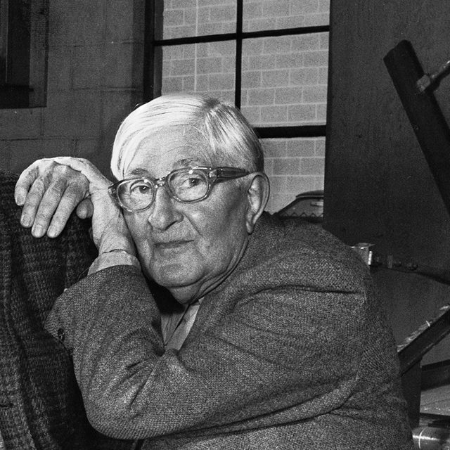 Josef AlbersPhoto: John T. Hill, CC BY-SA 4.0 · source
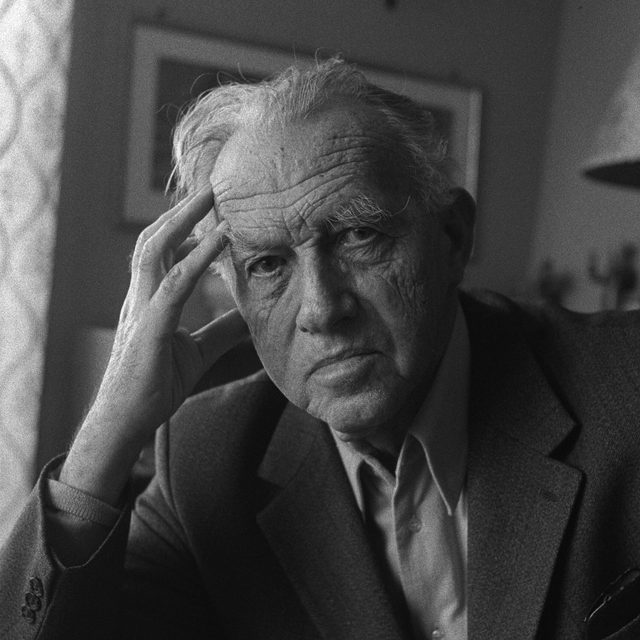 Eduard ImhofPhoto: Herbert Maeder, Kantonsbibliothek Appenzell Ausserrhoden, CC BY-SA 4.0 · source
 Jacques BertinPhoto: jeanbaptisteparis (Flickr), CC BY-SA 2.0 · source
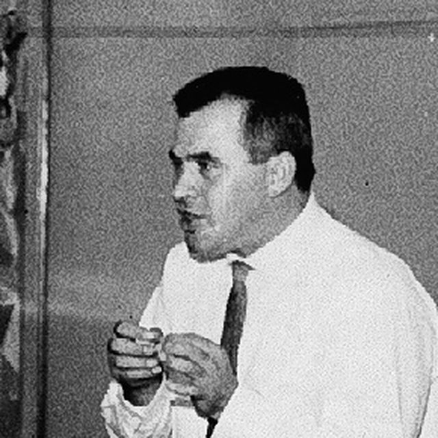 Otl AicherPhoto: Correio da Manhã / Arquivo Nacional (Brazil), public domain · source
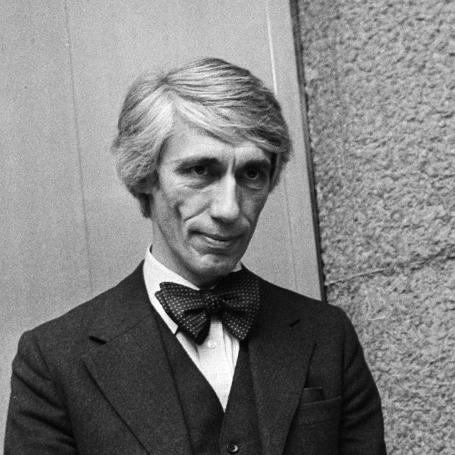 Wim CrouwelPhoto: Bert Verhoeff / Anefo, Nationaal Archief, CC0 · source
 Massimo VignelliPhoto: asheind / Wikimedia Commons, CC BY-SA 4.0 · source
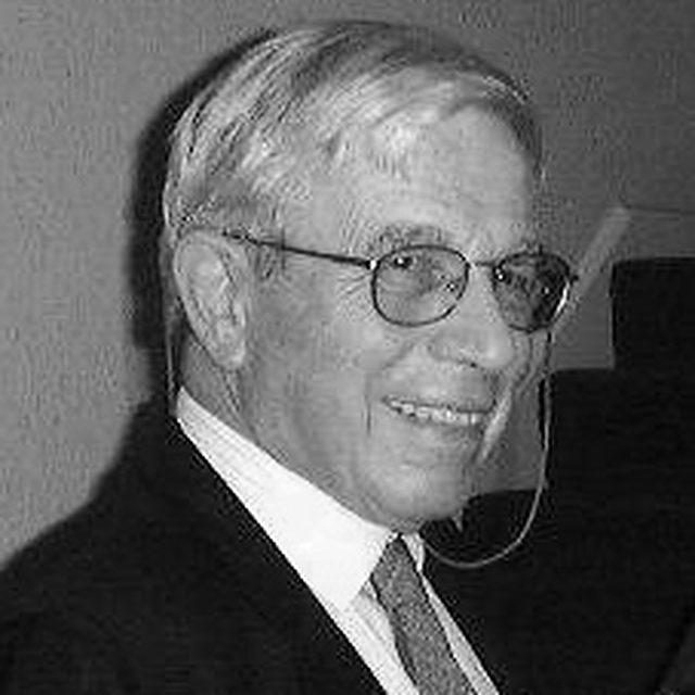 Andrew EhrenbergPhoto: J. A. Bound, public domain · source
 Matthew CarterPhoto: Christopher Lewis, CC BY 4.0 · source
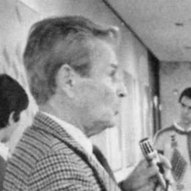 Josef Müller-BrockmannPhoto: Rochester Institute of Technology, News & Events, 1987, public domain · source
 Edward TuftePhoto: Keegan Peterzell, CC BY-SA 4.0 · source
 Robert BringhurstPhoto: Jason V, CC BY 2.0 · source
 Ben ShneidermanPhoto: Marc Smith, CC BY 2.0 · source
 Tobias Frere-JonesPhoto: Martin Kraft, CC BY-SA 3.0 · source
 Stephen FewPhoto: Francois Lamotte, CC BY 2.0 · source
 Bret VictorStill from Bret Victor, 'The Future of Programming' (2013), CC BY 3.0 · source
 Jeffrey HeerPhoto: Dominik Moritz, CC BY-SA 3.0 · source
 Tamara MunznerPhoto: Tim Bray, CC BY-SA 4.0 · source


