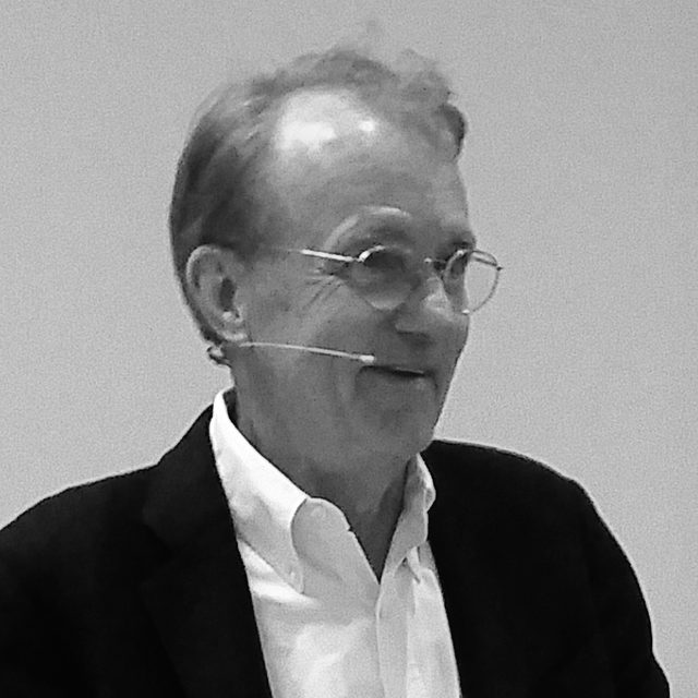
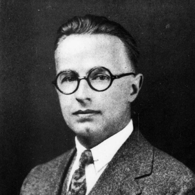
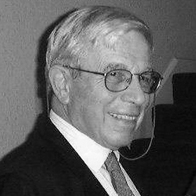
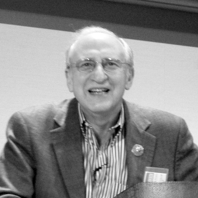
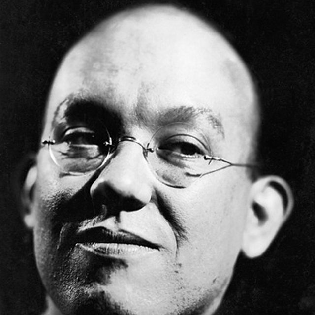
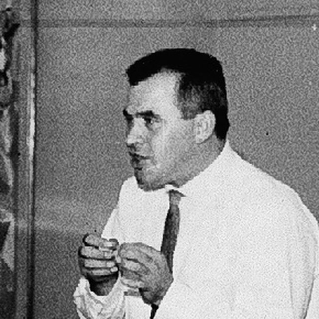
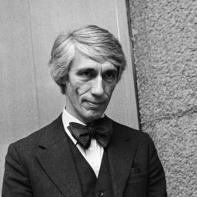
None of the rules in this guide was invented for dashboards. They come from people who spent careers on one part of the problem: how to divide a page, shade a map, keep an operator oriented, report a business, measure what a reader sees, and make a control answer.
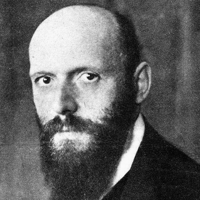
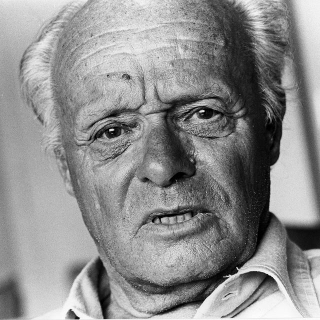
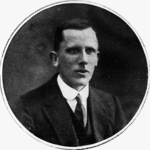
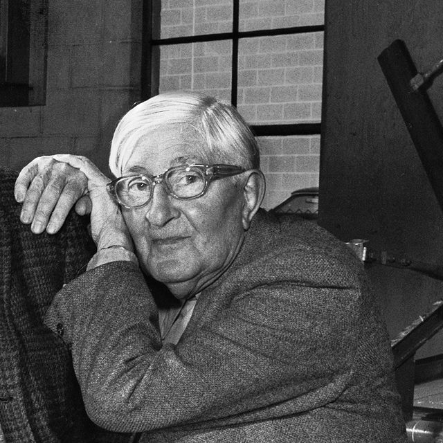
Select a face to read who they were and what they made
The people, by year. Each face is placed at the year of the work this guide draws on, in the lane of the field it came from. Most of the research is recent, and the forms it studies are much older.
Ten to know first
The people whose work carries the most rules, with their projects and a lesson each
1964Designing Programmes
Grid and type · 1964
Karl Gerstner
1930–2017 · Swiss designer
Write the rules first, and let the layouts follow from them.
One field, six column countsCapital’s page is 58 units wide with 2-unit gutters, so one, two, three, four, five or six columns all land on whole units.
Projects
1958Gerstner + Kutter
1962Capital grid
1964Designing Programmes
1972Compendium for Literates
What to learn from them
Before choosing column widths, pick a field whose width plus one gutter divides by every column count you need: Capital’s 58 units plus a 2-unit gutter make 60, which divides by one to six. Then give the important regions wider spans of that one grid.
The bullet graphOne bar on a linear scale, a tick for the comparator and bands for poor, fair and good replace a whole gauge.
Projects
2004Show Me the Numbers
2006Information Dashboard Design
2006Bullet Graph Design Specification
2008With Dashboards, Formatting and Layout Definitely Matter
What to learn from them
Replace each gauge with a bar on a linear scale and a tick for the comparator, and size dashboard regions by importance, so the main evidence gets a wide region and secondary measures narrow ones.
Word-sized sparklinesEach figure carries a line the height of a word showing its recent history, over a grey band for the normal range.
Projects
1983The Visual Display of Quantitative Information
1990Envisioning Information
1997Visual Explanations
2006Beautiful Evidence
What to learn from them
Set a word-sized sparkline of the last 12 to 26 periods beside each headline figure, with a grey band for the normal range where one exists, and delete any border, fill or grid line that carries no data.
Separate routine variation from signals before reacting.
Natural process limitsLimits at the average plus and minus 2.66 average moving ranges, from past values; only the point beyond them is a signal.
Projects
1924The control chart memorandum
1931Economic Control of Quality of Manufactured Product
1993Understanding Variation
What to learn from them
Before calling a week good or bad, compute natural process limits from a baseline of past values (the average plus and minus 2.66 times the average moving range) and flag only points outside them or long runs on one side of the average.
1759–1823 · Scottish engineer and political economist
Draw the difference as an area, and nobody has to subtract.
The balance as an areaImports and exports on one scale, with the space between the two lines tinted as the balance of trade, for or against.
Projects
1786The Commercial and Political Atlas
1801The Statistical Breviary
1805Statistical Account of the United States of America
What to learn from them
When a key figure is the difference between two series, such as plan and actual, plot both on one scale and fill the space between them with the gap labelled, so its size and sign over time can be read directly.
Choose each visual variable for what it can express.
The reorderable matrixThe same cells, with rows and columns permuted and no value changed, turn from a scatter into a diagonal band of groups.
Projects
1954Laboratoire de cartographie
1967Sémiologie graphique
1977La Graphique et le traitement graphique de l’information
What to learn from them
Match each encoding to the data before drawing: lightness or size for ordered quantities, hue or shape for categories, position for anything that must be compared precisely. Sort rows and columns by a meaningful value so that patterns form blocks.
Position along a common scale is read most accurately.
Ranking the elementary tasksWith McGill he found that readers judge position on a common scale most accurately, then length, angle, area and, last, shading.
Projects
1979Loess
1984Graphical perception
1985The Elements of Graphing Data
1996Trellis display
What to learn from them
Encode any quantity that must be compared precisely as position along a common scale, as aligned bars or dots, and keep angle, area and colour intensity for secondary or categorical information.
2015International Business Communication Standards
Reporting and statistics · 2015
Rolf Hichert
German consultant
Reports need a notation as fixed as a musical score.
Solid, outlined, hatchedOne fill per scenario in every report, solid for actual, outlined for plan and hatched for forecast, so hue stays free.
Projects
2004HICHERT+PARTNER
2013IBCS Association
2015IBCS version 1.0
2019Solid, Outlined, Hatched
What to learn from them
Fix one fill per scenario across every report (solid for actual, outlined for plan, hatched or lighter for forecast, grey for the previous period), so readers learn it once and hue stays free for highlighting.
Round hard, order by size, compare down the column.
Round, order, compare downThe same figures rounded to the two digits that vary, ordered by size in one column, with the average as a reference.
Projects
1972Repeat-Buying
1975Data Reduction
1977Rudiments of numeracy
1984The Dirichlet model
What to learn from them
Round each figure to the two digits that vary, order rows by size, put the numbers to be compared in a column, and add a row or column average as a reference.
Let people steer the data with visible, reversible controls.
Dynamic queriesDragging either handle of the range slider filters the scatter at once, so a question is steered by hand instead of typed.
Projects
1983Direct manipulation
1992Treemaps
1994Dynamic queries
1996The Eyes Have It
What to learn from them
Make every filter a visible control whose effect appears within about a tenth of a second and can be undone in one step; when an update takes longer, preview its effect before applying it.
Designers who treated a layout or a typeface as a system of compatible parts.
13 people
Jan Tschichold
1902–1974 · German typographer
1928 Die neue Typographie
Space instead of rulesTake the vertical rules out of a table and widen the gaps between columns; the space alone keeps the columns apart.
What to learn from themRemove the vertical rules from a table and widen the gaps between columns instead; keep a light horizontal rule only where rows are long enough for the eye to lose its line.
The Univers number gridIn Univers the first digit gives a face’s weight and the second its width, placing every face around 55, the regular.
What to learn from themBuild a dashboard’s type from one family arranged as a small matrix of weight and width, and give each role one cell, for example a heavier weight for values and a narrower width for column heads. When a new kind of label appears, assign it an existing cell before adding a style.
1942 Typography at the Allgemeine Gewerbeschule Basel
Fixed spaces around figuresOne fixed gap between sign and digits and one between value and unit keep a column even; varied gaps look ragged.
What to learn from themTreat the spaces around figures as fixed tokens: one gap between a value and its unit, one between a sign and its digits, one between columns. Check them at the smallest size in use, since uneven gaps make a column look ragged even when its figures align.
One date axis for every sportThe Munich 1972 schedule ran one date axis across every sport’s row, so any event is found by pictogram and day.
What to learn from themWhen a screen lists events across categories, run one shared axis, such as dates, across every row and mark each event in its cell, so a reader finds any item by row and column. Draw all symbols on one construction grid so they read as a set.
The number before the nameSetting each number right before its name, in lower case, joined the two fields and removed the need for leader dots.
What to learn from themIn a dense list, place the two fields that are read together side by side, so no leader dots or rules are needed to join them, and test the result with readers. Total Design’s 1983 revision of the directory enlarged the type and cut the columns from four to three after readers complained that the type was too small.
1970 New York City Transit Authority Graphics Standards Manual
The Unigrid sheetEvery park brochure is built on the same black title band and modular panel grid, whatever its size or content.
What to learn from themBefore designing any single view, write down the frame: the grid, the title band and two or three type sizes. Make each new view by filling that frame, and change the frame only when a view truly cannot fit it.
Ink trapsBell Centennial cuts notches into tight joins, so ink spreading on newsprint fills them instead of clogging the letter.
What to learn from themTest candidate faces at the smallest size and on the worst display the dashboard will meet, such as a projector or a low-density laptop, and keep the face whose figures 3, 5, 6, 8 and 9 stay distinct there.
Rows in whole linesEach field is a whole number of text lines, with one empty line between fields, so text and charts keep one rhythm.
What to learn from themDerive the grid from the text: fix the body size and line height first, then make row heights and vertical gaps whole multiples of that line height, so charts, cards and text share one baseline rhythm.
Say what the numbers areA neutral layout lends any figure authority, so one line on each board says if it is actual, plan, sample or model.
What to learn from themPut one line on every board that says what kind of numbers it shows (actual, plan, sample or model output), because a calm and exact layout lends authority to whatever figures it holds.
Spacing set by roleSmall capital labels get a little extra space between letters, table figures keep their own spacing and large figures close up slightly.
What to learn from themSet letter-spacing by role instead of accepting defaults: a little positive tracking for small capital labels, none for figures in a table, and check both at the size actually used.
Value and unit, unbrokenA no-break space ties each value to its unit, so 42 and km always move to a new line together.
What to learn from themPut a non-breaking space between every value and its unit so that no line break separates them, and choose a short scale of type sizes before designing any card, so every size on the screen comes from that list.
Bold the width of regularIn Retina a bold figure takes the space of a regular one, so a row turns bold without shifting the column.
What to learn from themIf a selected or total row in a table will turn bold, choose a face whose bold figures keep the regular width, and check it by overlaying the two weights at the size you will use.
Map makers who worked out how tone, strength and order carry hierarchy on a crowded sheet.
3 people
Arthur Robinson
1915–2004 · American cartographer
1941 OSS map division
Visual hierarchyEach element is ranked into one of four levels, each level gets one tone, and the subject stands forward while reference recedes.
What to learn from themBefore choosing tones, rank every element on the screen into three or four levels of importance, then give each level one weight or tone, so the main figure stands forward and frames, grid lines and labels recede.
Quiet ground, small strong marksStrong tone spread over large areas drowns the one mark that matters; on quiet low-tone areas the same small mark stands out.
What to learn from themKeep large surfaces such as the page, panels and table backgrounds in quiet low-saturation tones, and reserve full saturation for small marks that need attention, such as a value outside its range or the selected item.
Engineers who designed for operators who must notice a deviation at once.
3 people
David Woods
American researcher, Ohio State University
1983 Cognitive systems engineering
Visual momentumFrom overview to detail, the total, filters and date axis stay in place, and a small overview shows where the detail sits.
What to learn from themKeep recurring elements such as the date axis, the totals and the filters in fixed positions in every view, and repeat a compact overview on each detail screen, so a reader who moves between views does not have to search again.
The constraint as a shapeOpening stock plus receipts equals sales plus closing stock, so both columns end level and a broken identity shows as a step.
What to learn from themList the identities your figures must obey, such as opening stock plus receipts minus sales equals closing stock, and draw the most important one as geometry, so a broken constraint shows as a broken shape.
Analog scales with a normal bandEach measure gets a short scale with its normal range in grey; the value outside its band shows before any number is read.
What to learn from themGive each key measure a short scale with its normal range drawn as a grey band, keep everything inside the range in neutral tones, and add colour only when a value leaves the band, so that colour on the screen always means look here.
The people who set the conventions for charts, comparators, notation, tables and plain wording.
12 people
Étienne-Jules Marey
1830–1904 · French physiologist
1878 La Méthode graphique
The train graphStations sit down the side by distance and hours run across, so each train is a line whose slope is its speed.
What to learn from themWhen many items move through the same process, orders through stages or deliveries along a route, give them one pair of axes and draw each as a line, so delays show as changes of slope and conflicts as crossings.
Lengths and a heavy zeroThe same two quantities as areas, then as lengths on a common scale whose zero line is heavier than the grid.
What to learn from themShow quantities as lengths on a common scale, and draw the zero or 100 per cent base line more strongly than the other grid lines, two of the rules his committee published in 1915.
More signs, never bigger onesEach sign is worth the same amount, so a larger quantity gets more signs to count, never a bigger sign.
What to learn from themWhen a count matters, such as 80 orders not served, show it as repeated units of fixed value that can be counted, and never enlarge one symbol to mean more. Name one person to decide what the chart must say before anyone draws it.
Ernest Gowers
1880–1966 · British civil servant
1948 Plain Words
The plain wordPadded phrases struck out for the short word a reader would say, the same test applied here to a dashboard label.
What to learn from themLabel each figure the way a colleague would say it aloud, lost sales rather than unfilled demand quantity, and test every label by asking someone outside the team what it counts.
The range barA line from lowest to highest, a box for the middle half and a tick for the median, all on one scale.
What to learn from themWhere a row must show the spread of observed values, use a compact range bar: a thin line from lowest to highest, a box for the middle half and a tick for the median, on the same scale as the other rows.
Action dotsA mark appears only beside a measure that has crossed a threshold calling for action; the others carry no colour at all.
What to learn from themFor each measure on a status board, write down the values at which someone should act, for example crisis, actionably bad and actionably good, and show a mark only when a value crosses one; measures inside the bands need no colour at all.
Researchers who measured what readers see in a display and decide from it.
9 people
Josef Albers
1888–1976 · German-American artist and teacher
1933 Black Mountain College
One grey looks like twoThe two small squares are the same grey, yet it reads lighter on the dark ground and darker on the light one.
What to learn from themTest every status colour on each surface it will sit on, such as a white field, a grey panel and dark mode, and adjust it per surface instead of reusing one value and assuming it reads the same everywhere.
Common regionThe same dots pair up by nearness, then regroup as soon as a shared region encloses neighbours that are farther apart.
What to learn from themDraw a boundary or a shared background only around items that belong together in the reader’s task, because enclosure groups more strongly than nearness; two charts meant to be compared should sit on one surface.
Brushing and linkingItems selected in one chart light up in the other, while the rest stay in view instead of being filtered away.
What to learn from themLink the views on a screen by brushing: when a reader selects an item in one chart, highlight the same item in every other chart without filtering the rest away.
Computer scientist, University of Wisconsin–Madison
2011 Visual comparison for information visualization
Three ways to compareTwo series can be set side by side, overlaid on one axis, or replaced by their difference, drawn directly.
What to learn from themWhen two plans must be compared, choose deliberately between side by side, overlaid on one axis, or the difference drawn directly; if the decision turns on the gap, plot the gap itself. If an interval is needed, draw it around a point or as a graded band, since a whisker on a filled bar makes values inside the bar look likelier.
Size matters for colourThe same two tints that separate clearly as large areas become hard to tell apart as thin lines or small dots.
What to learn from themCheck every encoding colour at the smallest mark it will fill: a tint that separates two large areas can vanish on a 2 px line or a 6 px dot, so give small marks stronger lightness steps or a second cue.
Computer scientist, University of British Columbia
1997 H3
Eyes beat memoryTwo series on one axis are compared by eye; shown one after the other, the first must be held in memory.
What to learn from themState the user’s task in abstract terms, such as compare, locate or summarise, before choosing a chart; when the task is to compare, put the items side by side on one axis so the comparison is made by eye instead of from memory.
The quantile dotplotTwenty dots each carry a twentieth of the demand forecast; four past the stock line mean a one-in-five risk of running out.
What to learn from themWhen a forecast distribution exists, draw it as about twenty quantile dots so a reader can count the risk: four dots past the stock line means roughly a one-in-five chance of running out.
2019 What do we talk about when we talk about dashboards?
The table is a visualizationA sorted grid of aligned figures, with a small bar in each row, is where many analysts check and reshape their data.
What to learn from themDecide early whether a board is for deciding, monitoring or communicating, because the dashboard survey she co-wrote found that these purposes lead to different designs. Keep the underlying table one step from every chart, and let readers sort and annotate it in place.
People who put controls beside their effects, and who studied how plans are really made.
7 people
Jay Forrester
1918–2016 · American engineer and systems scientist
1951 Whirlwind
Stocks and flowsA stock changes only through its flows, receipts in and sales out, and the ordering rule driving receipts watches the stock.
What to learn from themBefore designing a planning view, write its stock equation (closing stock = opening stock + receipts − sales) and give each term its own mark on one scale, so the reader can see which flow moved the stock.
Forecast spread as uncertaintyWith several forecasts per style sorted by spread, the narrow styles are bought early and the wide ones wait for first sales.
What to learn from themWhere several people forecast the same items, show the spread of their forecasts for each item and sort by it; commit early to the narrow ones and hold back the wide ones until early sales arrive.
Checking judgmental adjustmentsEach manual change to the system forecast is checked against actual sales; small changes tended to hurt accuracy, large ones to help.
What to learn from themGive the forecast override a required reason and a log, and report after each period whether the change improved accuracy; adjustments of a few per cent deserve a second look before they are saved.
The reactive documentThe assumption sits in the sentence as a number the reader can drag, and the conclusion beside it recomputes as it moves.
What to learn from themPut the assumption a reader is most likely to question, such as a growth rate or a discount, inside the sentence that states the result as a draggable number, and recompute the sentence as it moves.
American computer scientist, University of Washington
2005 Prefuse
A visible analysis historyEach filter, selection and scenario becomes a named step with its own view, which the reader can revisit or undo.
What to learn from themGive an analysis a visible history: record each filter, selection and scenario change as a named step the reader can see, revisit and undo.
Sliders on their own consequencesEach slider sits on a chart of the result across its whole range, and a steep chart flags the assumption that matters.
What to learn from themDraw each input slider over a small chart of the result across that input’s whole range, with the current setting marked, so a reader sees which assumption matters before moving it.