Frame and measure
Before a single chart is drawn, a dashboard needs three things: a frame that can hold regions of unequal weight, a form that makes every number answer more than one question, and a way to tell news from noise.


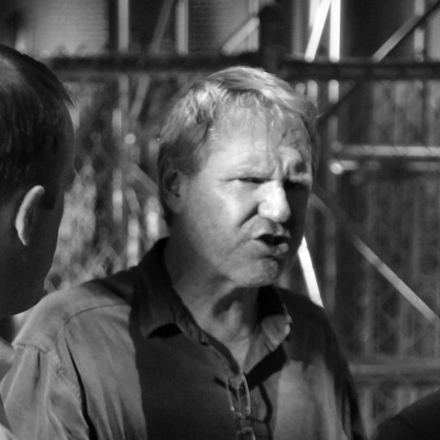

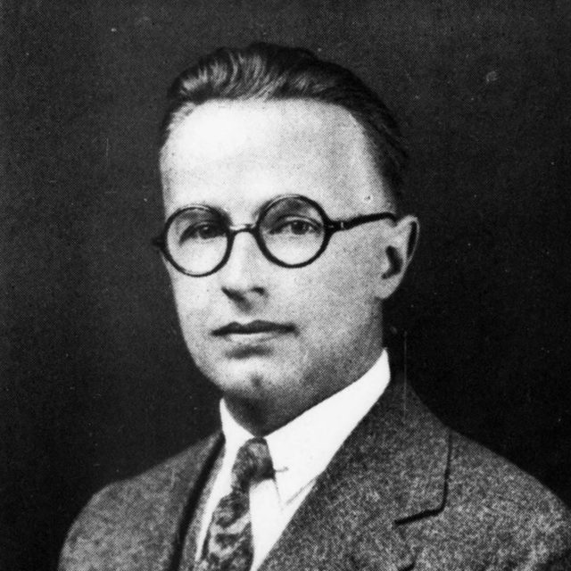
Gerstner, Müller-Brockmann, Vignelli, Few, Tufte, Hollifield, Brinton, Shewhart and Wheeler
Start from a grid that divides
Gerstner, Müller-Brockmann, Vignelli, Few
Karl Gerstner designed the layout grid of the German business magazine Capital in 1962 and published it in Designing Programmes two years later. The page is 58 units wide and the gutters are 2 units. Those two numbers let the same page carry one, two, three, four, five or six columns, each a whole number of units wide. The reason is their sum. Width plus one gutter is 60, and 60 divides by every count from one to six.
The rule carries straight into pixels, and this page is set on it. At full width its programme is twelve columns of 64 px with 32 px gutters, 1120 px in all. With one more gutter the sum is 1152, which divides by two, three, four, six, eight and twelve. Prose takes seven columns and the notes beside it the last four. Lists take four columns each, so their third column falls exactly under the notes, and every figure takes all twelve.
Inside, each figure keeps to the same programme. Its regions span whole columns: four for the controls and eight for the plot, or six and six. Four columns are 352 px and eight are 736, so with one gutter between them they make 1120 again. On a narrow screen the regions stack, with the controls on top.
A grid that divides many ways matters because the regions of a dashboard should not be equal. Stephen Few lists the rigid symmetrical grid among the common mistakes of dashboard design. When every panel has the same size, the layout claims that every panel has the same importance. A programme of compatible widths allows a wide region for the main evidence and narrow ones for the rest, and no edge falls off the grid.
The designers who taught the grid never treated it as a formula. Josef Müller-Brockmann, whose Grid Systems in Graphic Design of 1981 is the best-known manual of the method, called it an aid, not a guarantee. Hans Rudolf Bosshard’s The Typographic Grid shows about two dozen of his own works with the grids behind them, and no single recipe. Massimo Vignelli’s Unigrid, designed in 1977 for the United States National Park Service, is the same idea as a production system: one sheet structure and one set of rules behind the brochures of more than four hundred parks.
Seen in our work: Route and pricing model, note 4 → chapter 7
Choose a width whose sum with one gutter divides by every column count you need, then make the regions unequal on purpose.
Set the width to 1176 px with 24 px gutters. Which column counts gain whole pixels, which one loses them, and why?
Give every number an instrument
Few, Tufte, Hollifield, Brinton
A number on a card answers one question: how much. A reader who has to act on it needs four more answers in the same glance: of what, on what scale, compared with what, and by how much it differs. Stephen Few’s bullet graph, specified in 2006, fits those answers into one small mark, with a bar for the measure, a tick for the comparator and a scale behind both. Edward Tufte’s sparkline goes smaller still. It is a word-sized graphic that sets a value beside its recent history, and in his medical examples beside a grey band for the normal range.
Control rooms reached a similar form for a different reason. Guidance for process-plant operators asks for grey screens, analog indicators with a marked normal range, and saturated colour reserved for abnormal states, so that a deviation is the only thing that stands out. The instrument in the figure below borrows that restraint. It shows a large value with its unit, a bar drawn to scale, one ink tick where a comparator exists, and the gap in figures beside the name of what it is measured against.
The bullet graph has critics worth hearing. Nick Desbarats lists eleven objections, among them that problems do not stand out and that words such as good, satisfactory and poor mean different things to different people. The instrument below therefore leaves the qualitative bands out. Where no comparator exists, a part of a whole can take its place: orders shipped out of orders taken, or money spent out of a budget. Amazon’s weekly business review, as Cedric Chin describes it from Colin Bryar’s practice, holds one form across hundreds of measures. Most charts plot the trailing six weeks beside the trailing twelve months, so the form is learned once.
Seen in our work: FDA Catalyst, note 1 → chapter 7
Give each headline number its unit, a scale, one comparator and the gap, and leave out bands nobody can define.
Switch off the comparator. Which questions can the card no longer answer, and what would a reader have to remember instead?
Compare against routine variation
Shewhart, Wheeler
A weekly figure always differs from the week before, and most of those differences mean nothing. Donald Wheeler’s Understanding Variation gives a test that needs no model. Plot the individual values, take the average distance between neighbours, and draw limits at 2.66 of those average ranges on either side of the mean. A point inside the limits is routine. A point outside is a signal that deserves an explanation.
This is the comparator an instrument should graduate to once a measure has some history. Until then a named reference, such as the last four weeks, is the more candid choice, as long as the instrument prints its name.
Not yet in our work; the closest is Two kinds of scarcity, note 2 → chapter 7
Treat a change as news only when it leaves the limits of routine variation, and say which reference you used until you have them.
Drag the latest week up until it turns ink. How far is it from the average, in moving ranges?