Dashboards we made
Seven dashboards we built with the rules in this guide, opened up. Each one answers one question for one reader, and every note on its screen points to the rule it follows. Five are private cases, described without the client’s name.
7 dashboards and 40 notes, each note tied to one of the twelve rules
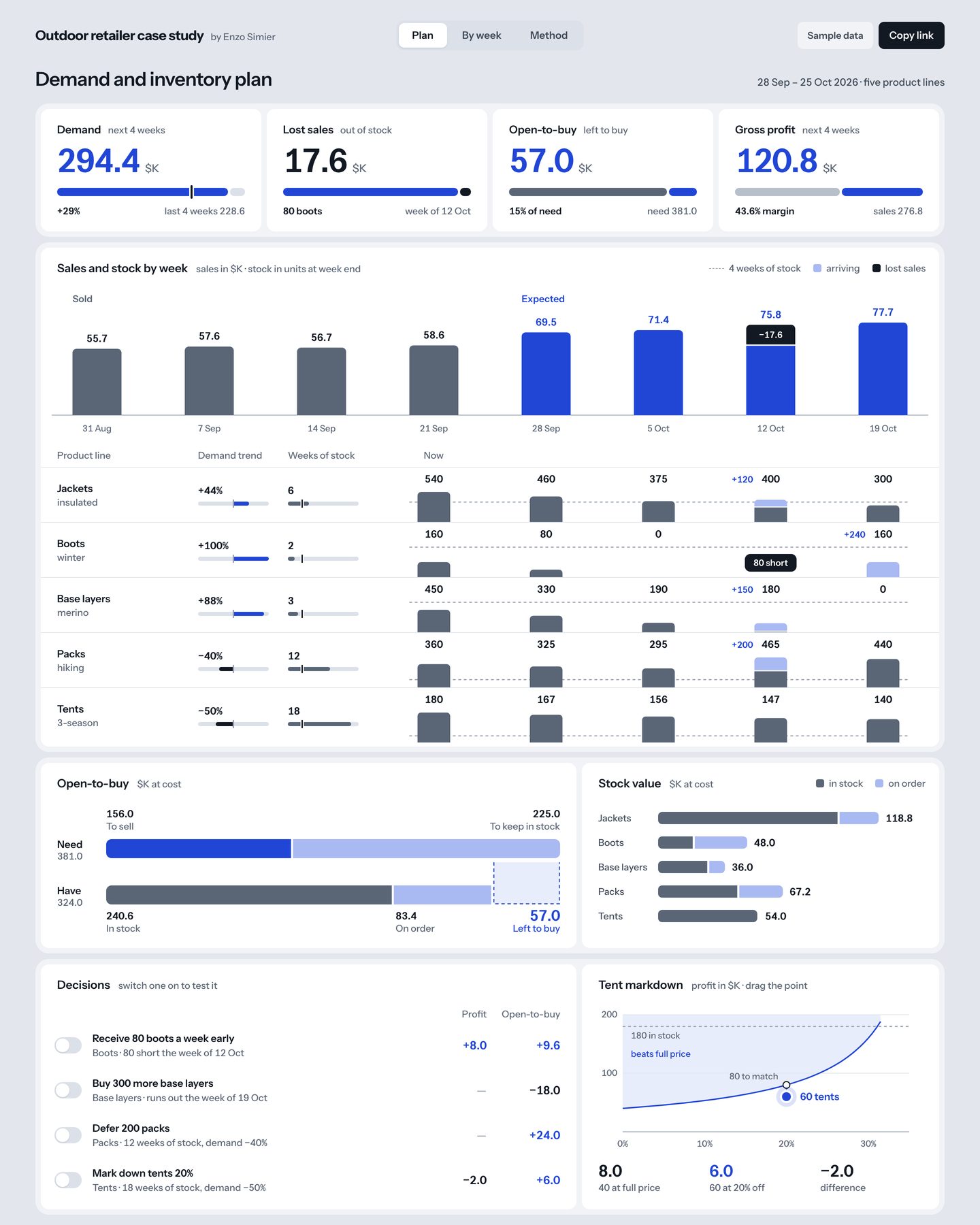
Demand and inventory plan
Which product lines will run short or hold too much stock in the next four weeks, and how much can still be bought?
- 1
Four instruments, one form
Each card gives a value and its unit, a rail drawn to scale and the gap to a named comparator: demand is +29% on the last four weeks. Where no comparator exists, the rail shows a part of a whole, such as open-to-buy at 15% of need.
Rule 2 · Give every number an instrument - 2
Terms glossed in the title
Each card title pairs the planner’s term with plain words: open-to-buy reads “left to buy” and lost sales reads “out of stock”. A chip in the header says the figures are sample data.
Rule 12 · Use plain words, and say what the numbers are - 3
Ink for what is lost
Weeks already sold are slate and expected weeks are cobalt. The 17.6 $K of sales lost in the week of 12 October is an ink cap on its bar, so the shortfall needs no red.
Rule 6 · Give each fill one job - 4
Stock rows on the sales weeks
Each product line’s stock is drawn on the same week columns as the sales above it. The 80 boots short sit directly under the week whose sales they cost.
Rule 7 · Share one axis - 5
The budget as an identity
Need is what will sell plus the stock to keep, and have is stock in hand plus stock on order. The dashed box between the two bar ends is the 57.0 left to buy, so the drawing cannot disagree with the arithmetic.
Rule 4 · Draw the identity - 6
Decisions as labelled switches
Each decision is a switch with its effect on profit and open-to-buy printed beside it, and every figure on the page is recomputed when one is on. The tent markdown is tested by dragging a point on its own chart.
Rule 11 · Put each control on its consequence
- Every card compares against the last four weeks. Once a year of weekly history exists, limits of routine variation (rule 3) should take over, so that a +29% can be told apart from noise.
- Expected sales are one arithmetic plan with no error attached. When a fitted forecast exists, the cobalt bars can become quantile dotplots (rule 10).
New verticals weekly review
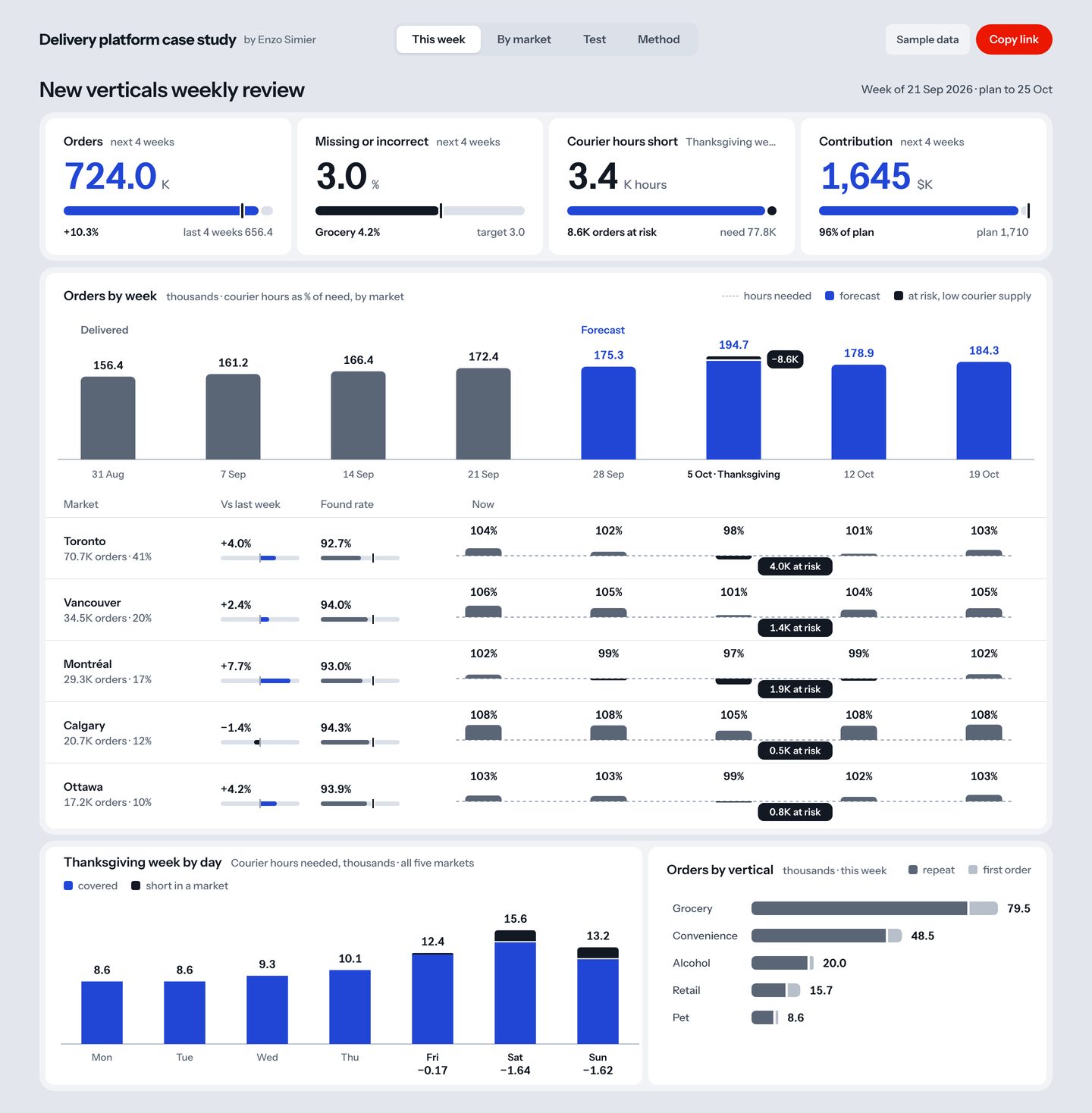
Will the new verticals reach plan over the next four weeks, and where will courier hours fall short in Thanksgiving week?
- 1
The week and the horizon
The header names the week under review and how far the plan runs, and a chip says the figures are sample data.
Rule 12 · Use plain words, and say what the numbers are - 2
A target drawn as a tick
Missing or incorrect orders run at 3.0% against a target of 3.0, marked by a tick on the rail. The card also names the worst vertical: grocery, at 4.2%.
Rule 2 · Give every number an instrument - 3
Ink for orders at risk
Delivered weeks are slate and forecast weeks are cobalt. The 8.6K orders at risk in Thanksgiving week are an ink cap on the forecast bar, so the shortfall needs no red.
Rule 6 · Give each fill one job - 4
Markets on the same weeks
Each market’s courier hours, as a share of need, sit on the week columns of the chart above. Toronto’s 4.0K orders at risk fall under the Thanksgiving column.
Rule 7 · Share one axis - 5
Shortfalls printed by day
Hours needed are printed above each day’s bar, and the shortfall under Friday, Saturday and Sunday. The three printed shortfalls add up to the 3.4K hours short in the card at the top.
Rule 5 · Shade for hierarchy, print the quantity - 6
A ranked list with its figures
Verticals are sorted by size, each bar split into repeat and first orders, with the total printed at the end of the bar.
Rule 8 · Set tables to be read
- Found rate in each market is read against a fixed tick. With a few months of weekly data, limits of routine variation (rule 3) would show which drops deserve a question.
- The levers and the substitution test sit below this view, so on a laptop the decisions are out of sight until the reader scrolls.
Ballottage
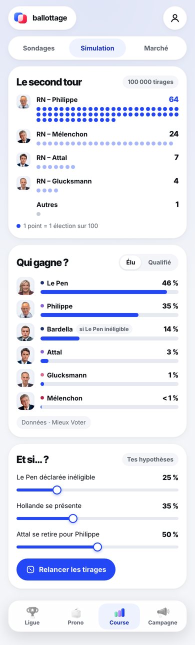
Who is most likely to win the second round of the 2027 French presidential election, and how sure can anyone be?
- 1
Chances a reader can count
Each second-round pairing is a row of dots from 100,000 simulated elections, and the key says one dot is one election in a hundred. A reader counts the 64 of the leading pairing, as in a quantile dotplot.
Rule 10 · Show uncertainty only when it is earned - 2
One saturated row
Only the most likely pairing is drawn in full blue, and the others are a light tint. Every count is printed at the end of its row.
Rule 5 · Shade for hierarchy, print the quantity - 3
One switch, two questions
A two-way switch, Élu and Qualifié, turns the same list from the chance of being elected to the chance of reaching the second round, inside the card it changes.
Rule 11 · Put each control on its consequence - 4
Party colour kept to a dot
Each candidate’s party colour appears only as a small dot before the name. The bars stay one blue, so colour never competes with length.
Rule 6 · Give each fill one job - 5
A condition in words
One candidate’s line carries a chip saying he counts only if another is ineligible, so his share reads as conditional. The source of the polls is printed under the list.
Rule 12 · Use plain words, and say what the numbers are
- The what-if sliders sit below the results they change, so on a phone the dots are off screen when the draws are run again. Moving the sliders into the second-round card would put each control on its consequence (rule 11).
- On a laptop the app stays one phone-width column. A wider layout could set the simulation beside the what-if sliders.
FDA Catalyst
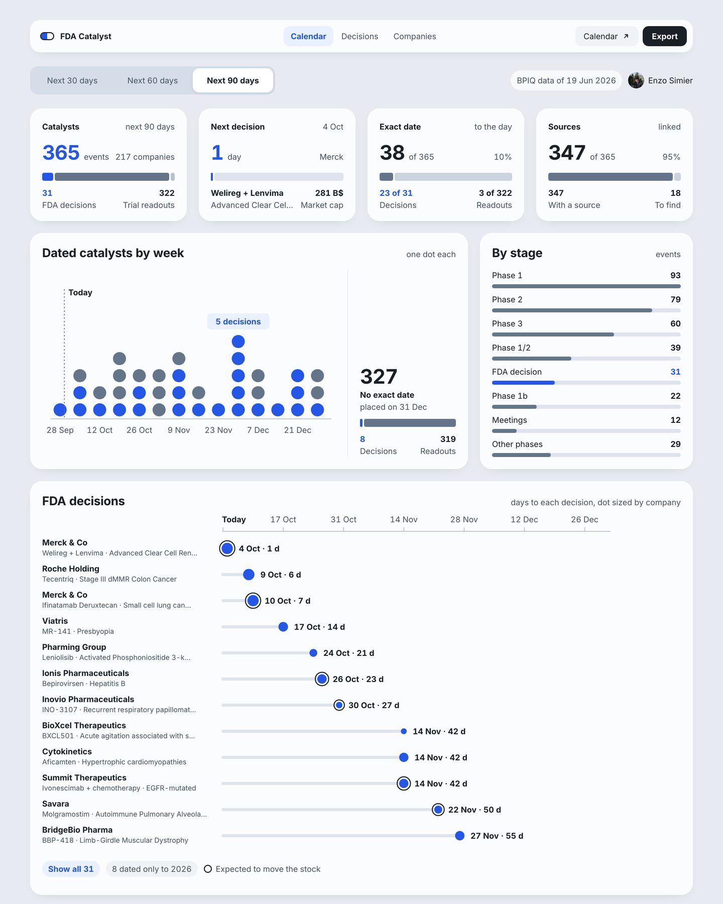
Which FDA decisions and trial readouts fall in the next 90 days, and which of their dates can be trusted to the day?
- 1
A count with its parts
365 catalysts sit over a rail split into 31 FDA decisions in blue and 322 trial readouts in slate, with both counts printed at its ends.
Rule 2 · Give every number an instrument - 2
How many dates are exact
A card counts the events dated to the day, 38 of 365, before any chart uses a date. A chip in the header dates the copy of the data the page reads: 19 June 2026.
Rule 12 · Use plain words, and say what the numbers are - 3
Blue means an FDA decision
Blue marks FDA decisions everywhere on the page: the dots, the rails, the stage list and the timeline. Every other catalyst is slate, so decisions can be counted across the page.
Rule 6 · Give each fill one job - 4
Vague dates kept off the axis
The source places events with no exact date on 31 December. The chart leaves those 327 events off the week axis and counts them in a column of their own, so no false date is drawn.
Rule 10 · Show uncertainty only when it is earned - 5
One axis for every decision
Each FDA decision is a line from today to its date on one shared axis of days, with the date and the days to go printed at its end. Dot size gives company size, and a ring marks an expected mover.
Rule 7 · Share one axis - 6
One accent in a quiet list
In the stage list every bar is slate except FDA decision, and each count is printed at the right. The bars give the order and the numbers give the amounts.
Rule 5 · Shade for hierarchy, print the quantity
- The page reads a copy of the calendar taken on 19 June and counts days from the reader’s date, so a date that has moved since then still shows its old value. The chip should warn once the copy is more than a month old.
- Long indications are cut with an ellipsis. A second line in the label column would keep them readable.
Route and pricing model
Can a fleet of uncrewed cargo aircraft serve the fourteen villages of Nunavik below today’s air rate and still pay back its cost?
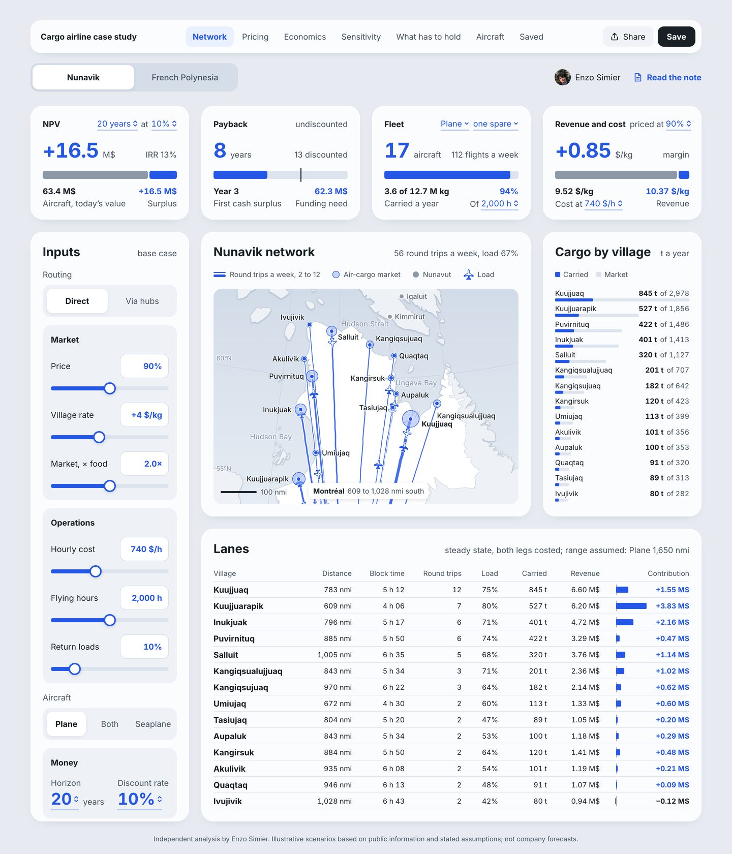
- 1
Assumptions set in the card
The NPV card states its horizon and discount rate, 20 years at 10%, as menus in its own header, so each assumption sits on the number it changes.
Rule 11 · Put each control on its consequence - 2
NPV as an identity
The rail splits what the network earns, in today’s money, into the cost of the aircraft, 63.4 M$, and the surplus, +16.5 M$. The headline figure is the cobalt part, drawn to scale.
Rule 4 · Draw the identity - 3
Margin against cost
Cost and revenue per kilogram share one rail, and the margin is its short cobalt end: 9.52 against 10.37 $/kg, printed at either side.
Rule 2 · Give every number an instrument - 4
Twelve columns, unequal regions
The board is set on twelve columns with 24 px gutters. The cards take three columns each, the body splits three, six and three, and the lanes table takes nine, so the map and the table get the widest regions.
Rule 1 · Start from a grid that divides - 5
A table set to be read
Figures align right in tabular numerals, rules are hairlines, and a bar column for contribution turns the table into a ranking without leaving it.
Rule 8 · Set tables to be read - 6
What the figures are
The footer says the figures are illustrative scenarios built from public information and stated assumptions, and that none of them is a company forecast.
Rule 12 · Use plain words, and say what the numbers are
- The lanes table is ordered by round trips and the cargo list by tonnage, so Inukjuak and Puvirnituq swap places between them. One order for both would let a reader carry a village from one to the other.
- Payback and NPV are single figures. The inputs are uncertain enough that a range from the sensitivity view would be earned on the cards (rule 10).
Two kinds of scarcity
Which of two energy companies, a shale oil producer and a power generator, offers more from today’s price, and what has to hold for each?
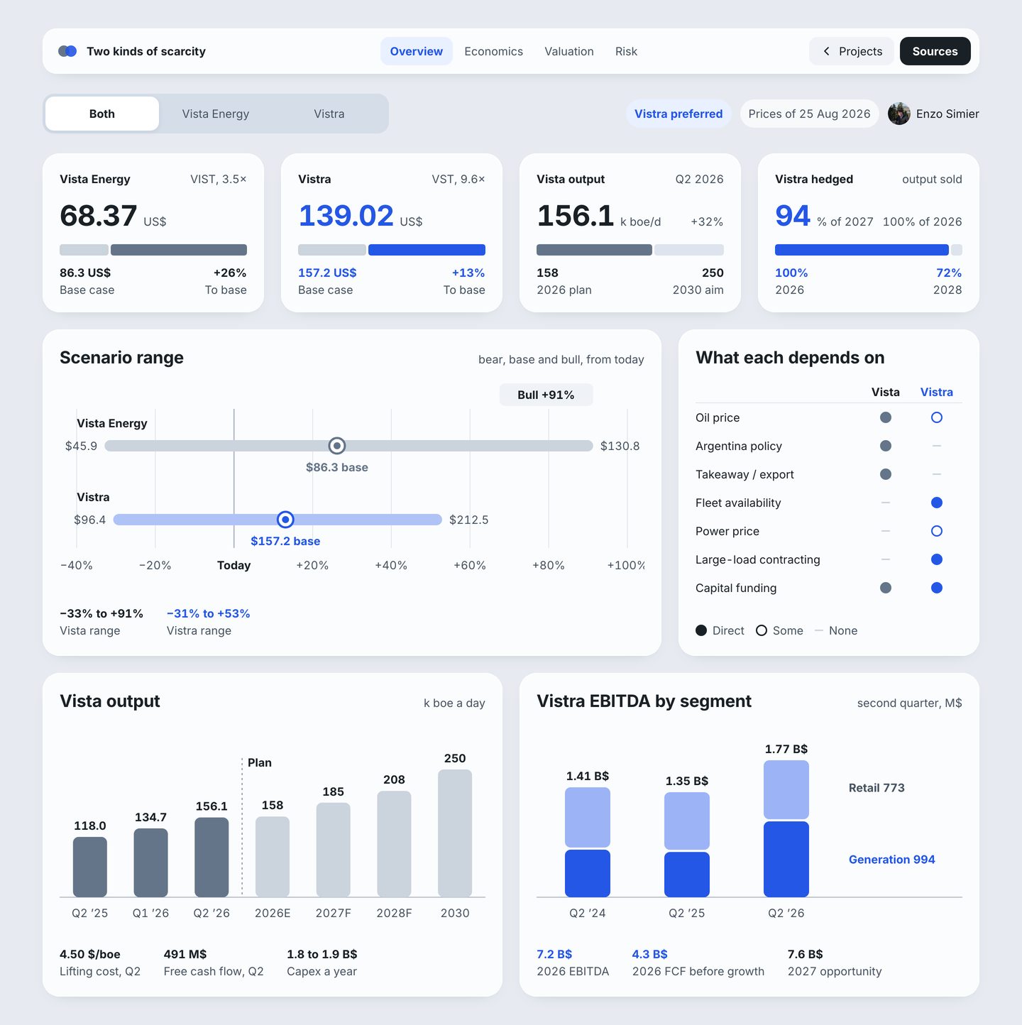
- 1
One colour per company
Blue is Vistra and slate is Vista Energy in every card and chart. The switch at the top dims whichever company is out of focus.
Rule 6 · Give each fill one job - 2
Price against the base case
Each price card sets today’s price against the base-case value on one rail and prints the gap: +26% to base for Vista Energy, +13% for Vistra.
Rule 2 · Give every number an instrument - 3
Ranges that say what they are
Both companies share one axis of change from today’s price. The chart names its three cases, bear, base and bull, so the band claims no probability it does not have.
Rule 10 · Show uncertainty only when it is earned - 4
A table read by its marks
Exposure is a filled dot, an open dot or a dash for direct, some or none, set in two columns that read down. The key sits under the table.
Rule 8 · Set tables to be read - 5
Plan marked as plan
Reported quarters are solid slate. After a dashed line labelled Plan, the company’s targets are a light tint, and the axis says E and F for estimate and forecast.
Rule 12 · Use plain words, and say what the numbers are - 6
Labels at the marks
The segments are named at the bars, Retail 773 and Generation 994, and each total is printed above its bar, so no legend has to be matched by colour.
Rule 5 · Shade for hierarchy, print the quantity
- Prices are fixed at 25 August 2026. A reader weeks later sees an upside computed from an old price, and the chip could say how many days old it is.
- The +100% tick at the right end of the scenario axis is clipped by the edge of the chart.
Water pricing and meters
What price per cubic metre balances a municipality’s water budget, and what does it do to the charge on each dwelling?
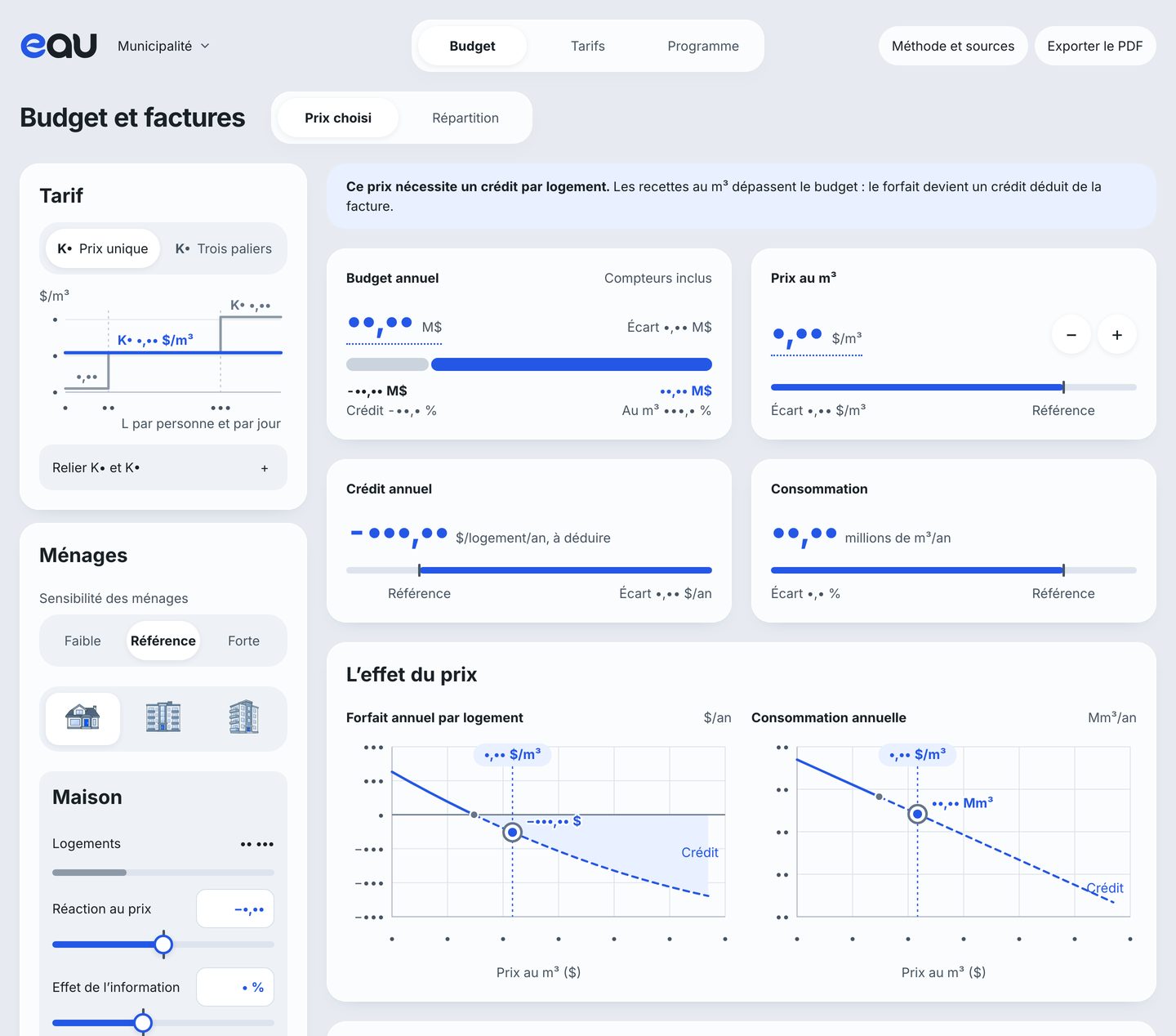
- 1
Two tariffs, one axis
The single price and the tiered tariff are drawn on the same axis of litres per person per day, so the reader sees where each tier starts before choosing between them.
Rule 7 · Share one axis - 2
An odd result in a sentence
When the price raises more than the budget needs, a sentence says what follows: the flat charge becomes a credit deducted from each bill.
Rule 12 · Use plain words, and say what the numbers are - 3
The budget as an identity
The rail under the budget sets what the price per cubic metre raises against the flat charge, which becomes a credit handing back the excess when that revenue runs past the budget. The parts always sum to the budget.
Rule 4 · Draw the identity - 4
Distance from the reference
Every card prints its gap to the reference scenario and marks the reference with a tick on its rail, so a change of price shows how far the plan has moved.
Rule 2 · Give every number an instrument - 5
The price chosen on its curve
Each curve is also the control: dragging along it chooses the price, and the whole page is recomputed. The reader sees the charge per dwelling and total consumption across the whole range of prices before choosing one.
Rule 11 · Put each control on its consequence
- The card for the annual credit prints a hyphen where the chart prints a true minus sign. One minus sign throughout would keep the figures consistent, as the rule on type for figures asks.
- The consumption curve rests on an assumed price response. The page already runs Monte Carlo draws in another view, and a band from those draws on this curve would be uncertainty that is earned.